Confluence Cloud - Lucky Chart & Diagrams
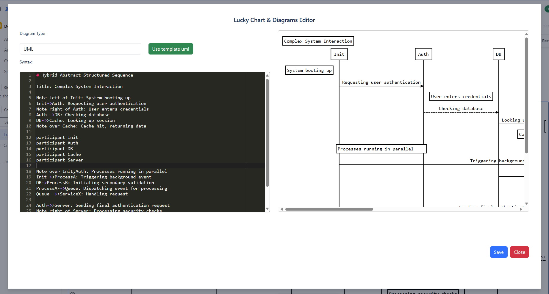
Table of Contents
Sequence Diagrams
Create professional UML sequence diagrams with a simple text syntax that automatically renders into visual diagrams.
Best Practice
Sequence diagrams are ideal for visualizing interactions between system components, API calls, or business processes. They help teams understand complex workflows and identify potential issues in system design. Our diagrams are powered by js-sequence-diagrams, offering a simple yet powerful way to render these visuals directly from text-based definitions.
Basic Syntax
The basic syntax follows these patterns:
Basic Sequence Diagram Example
Title: Diagram Title
Participant A as Alice
Participant B as Bob
A->B: Normal line
B-->A: Dashed line
A->>B: Open arrow
B-->>A: Dashed open arrow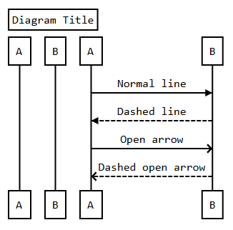
Notes and Comments
Add contextual information to your diagrams with notes and comments:
Notes Syntax
# Example of a comment (not rendered in diagram)
Note left of A: Note to the\n left of A
Note right of A: Note to the\n right of A
Note over A: Note over A
Note over A,B: Note over both A and B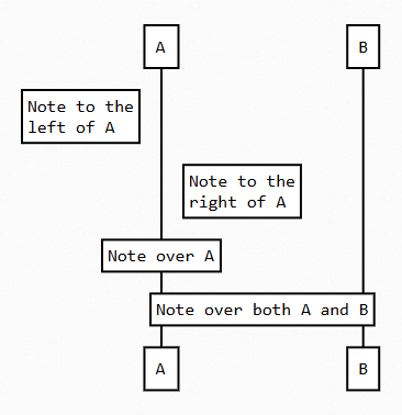
Participant Order
Control the order of participants in your diagram by explicitly declaring them:
Participant Order Example
participant C
participant B
participant A
Note right of A: By listing the participants\n you can change their order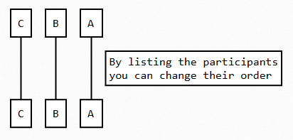
Complex Example
Combine all elements to create comprehensive system diagrams:
Complex System Interaction
# Hybrid Abstract-Structured Sequence

Title: Complex System Interaction

Note left of Init: System booting up
Init->Auth: Requesting user authentication
Note right of Auth: User enters credentials
Auth-->DB: Checking database
DB->>Cache: Looking up session
Note over Cache: Cache hit, returning data

participant Init
participant Auth
participant DB
participant Cache
participant Server

Note over Init,Auth: Processes running in parallel
Init->>ProcessA: Triggering background event
DB->ProcessB: Initiating secondary validation
ProcessA-->Queue: Dispatching event for processing
Queue-->>ServiceX: Handling request

Auth->>Server: Sending final authentication request
Note right of Server: Processing security checks
Server-->>User: Authentication success

Note over all: System fully operational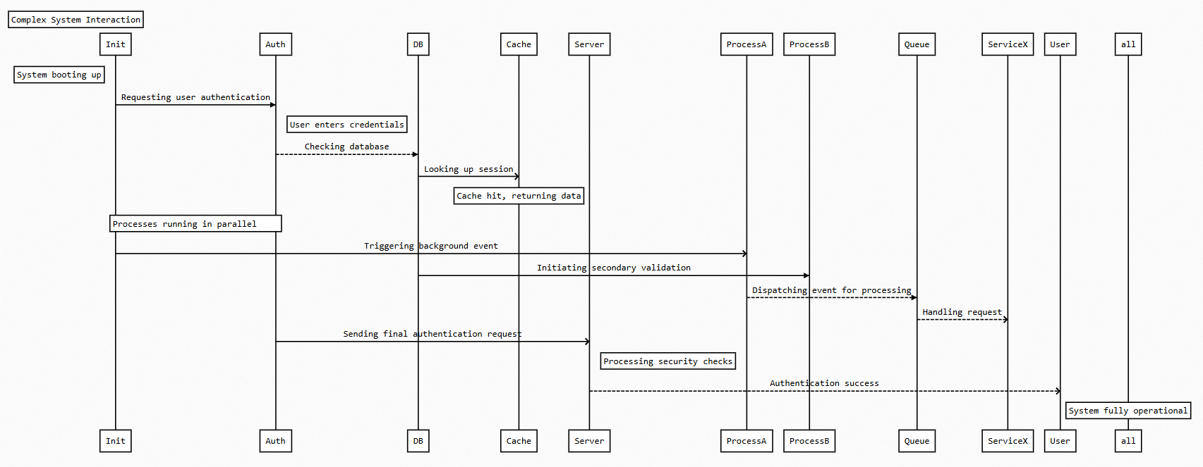
Syntax Reference
| Syntax | Description | Example |
|---|---|---|
Title: text |
Diagram title (displayed at top) | Title: Login Sequence |
participant X |
Declare participant with default name | participant AuthService |
participant X as Y |
Declare participant with display name | participant A as "Authentication Service" |
X->Y: text |
Solid line with filled arrow (synchronous call) | User->Server: Request |
X-->Y: text |
Dashed line with filled arrow (asynchronous call) | Server-->DB: Query |
X->>Y: text |
Solid line with open arrow (return message) | DB->>Server: Response |
X-->>Y: text |
Dashed line with open arrow (async return) | Server-->>User: Data |
Note [position] of X: text |
Add note to participant (use \n for new lines) |
Note left of User: Starts flow |
# comment |
Add comment (not rendered in diagram) | # This is a comment |
Multi Chart Syntax
Create sophisticated multi-dataset charts with a simple, declarative syntax that automatically renders into beautiful visualizations.
When to Use Multi Charts
Multi charts are perfect for comparing multiple datasets over the same categories or time periods. Use them for financial reports, performance comparisons, trend analysis, and any scenario where you need to visualize relationships between different data series.
Basic Structure
The multi chart syntax follows this pattern:
Multi Chart Basic Syntax
[ChartType]
{"Key1", "Key2", "Key3", ...}               // Label list
"Dataset1" (value1, value2, value3, ...)    // Named dataset
(value1, value2, value3, ...)               // Unnamed dataset
...
Supported Chart Types
BarChart
Standard vertical bar chart for comparing discrete categories.
StackedBarChart
Bar chart where series are stacked on top of each other.
HorizontalBarChart
Horizontal version of the bar chart for longer labels.
LineChart
Shows trends over time or ordered categories.
RadarChart
Displays multivariate data on axes radiating from center.
LineBoundariesChart
Shows range between upper and lower boundaries.
Grammar Rules
Multi Chart Grammar Specification
Chart Definition
[ChartType] { labelList } ( dataList )Label List
{"String1", "String2", "String3", ...}Data List (one or more entries)
"DatasetName" (number, number, ...)  // Named dataset
(number, number, ...)                // Unnamed dataset
Numbers
42        // Positive integer
3.14      // Positive decimal
-7        // Negative integer
-0.5      // Negative decimal
Example Charts
Bar Chart with Two Datasets
Compare quarterly performance of two products:
[BarChart]
{"Q1", "Q2", "Q3", "Q4"}
"Product A" (12, 19, 3, 5)
"Product B" (8, 15, 12, 10)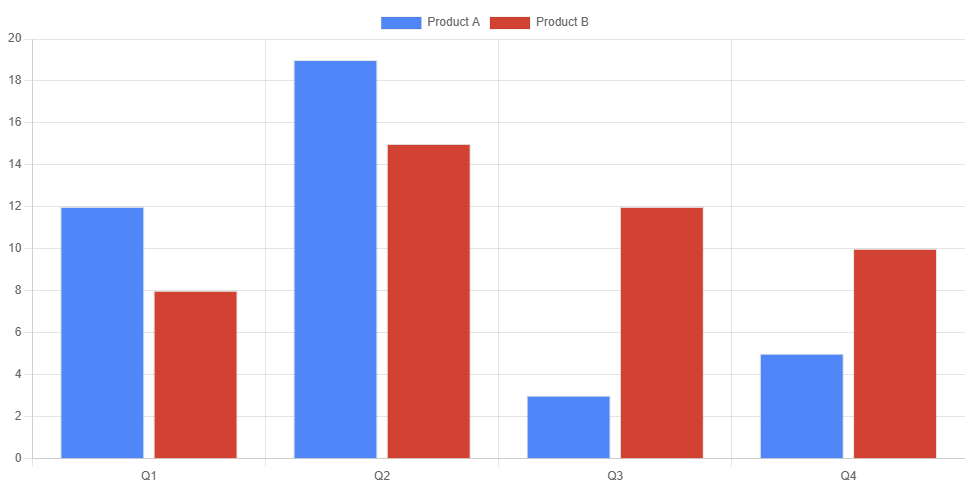
Line Chart with Unnamed Datasets
Track monthly metrics with automatic dataset naming:
[LineChart]
{"Jan", "Feb", "Mar", "Apr"}
(65, 59, 80, 81)
(28, 48, 40, 19)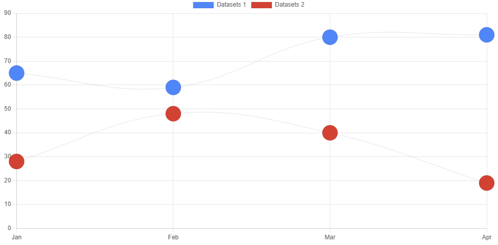
Stacked Bar Chart
Show composition of metrics by category:
[StackedBarChart]
{"Morning", "Afternoon", "Evening"}
"Weekdays" (30, 45, 25)
"Weekends" (15, 60, 40)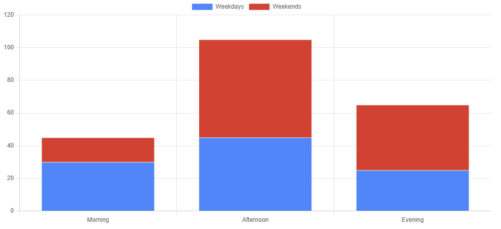
Validation Rules
- Consistent data size: All datasets must have the same number of values as there are keys/labels
- Automatic naming: Unnamed datasets will be labeled as "Dataset 1", "Dataset 2", etc.
- Number formats: Supports integers, decimals, positive and negative values
- String formatting: Labels and dataset names must be quoted with double quotes
Single Chart Syntax
Create simple but powerful single-dataset charts with minimal syntax, perfect for showing proportions and distributions.
When to Use Single Charts
Single charts are ideal for showing part-to-whole relationships, such as market share, survey results, or resource allocation. They work best when you want to emphasize proportions rather than precise values.
Basic Structure
The single chart syntax uses a simple key-value format:
Single Chart Basic Syntax
[ChartType]
Label1 = Value1
Label2 = Value2
Label3 = Value3
...
Supported Chart Types
PieChart
Classic pie chart showing proportions of a whole.
DoughnutChart
Pie chart with center cut out, allowing for additional information.
PolarChart
Shows data on radial axes, useful for cyclical data.
Example Charts
Basic Pie Chart
Simple color distribution example:
[PieChart]
Red = 12
Blue = 19
Yellow = 3
Green = 5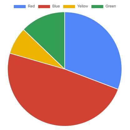
Doughnut Chart with Multi-word Labels
Regional distribution with descriptive labels:
[DoughnutChart]
North America = 45
South America = 20
Europe = 30
Asia = 40
Africa = 15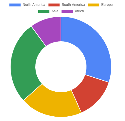
Polar Area Chart
Monthly metrics in polar format:
[PolarChart]
January = 65
February = 59
March = 80
April = 81
May = 56
June = 55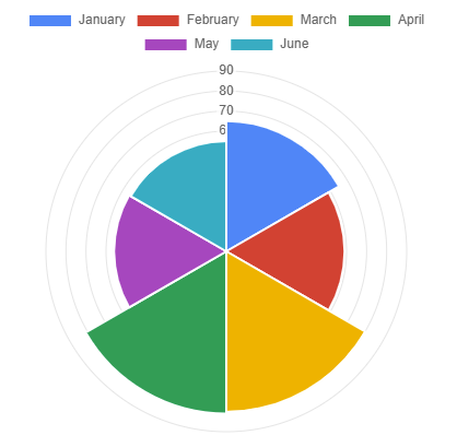
Validation Rules
- Format: Each label must be followed by an equals sign and a number
- Labels: Must start with a letter (A–Z) and can contain multiple words—no quotes needed.
- Values: Can be negative (negative values are accepted and processed as-is)
- Precision: Decimal values are supported
- Separators: No commas between entries (newline-separated only)
Need Help?
If you have any questions about using Lucky Chart & Diagrams in Confluence Cloud, please contact our support team or consult the Confluence documentation for additional resources.
Contact Support